The Stage Comparison plot has a more complex coloring option tool than other charts in Well Data Labs. There is the possibility of viewing and seeking much more complex data, so we've built some features to help divide up that data.
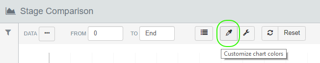
Click on the dropper icon on the toolbar of the graph to bring up the Chart Colors box.
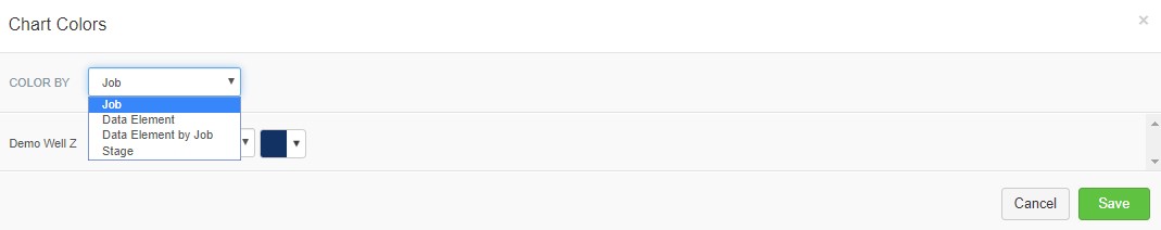
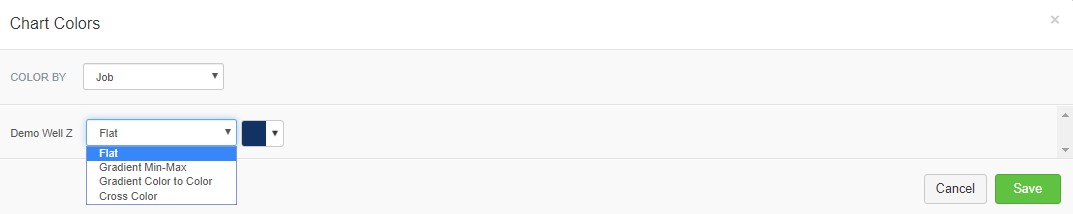
There are three main divisions on the Chart Colors box. You can set each Job, each Data Element, or each Data Element from each Job to have a unique color set. You'll only see a difference between these settings if you have multiple Data Elements or stages from multiple Jobs selected when you open the Chart Colors box.
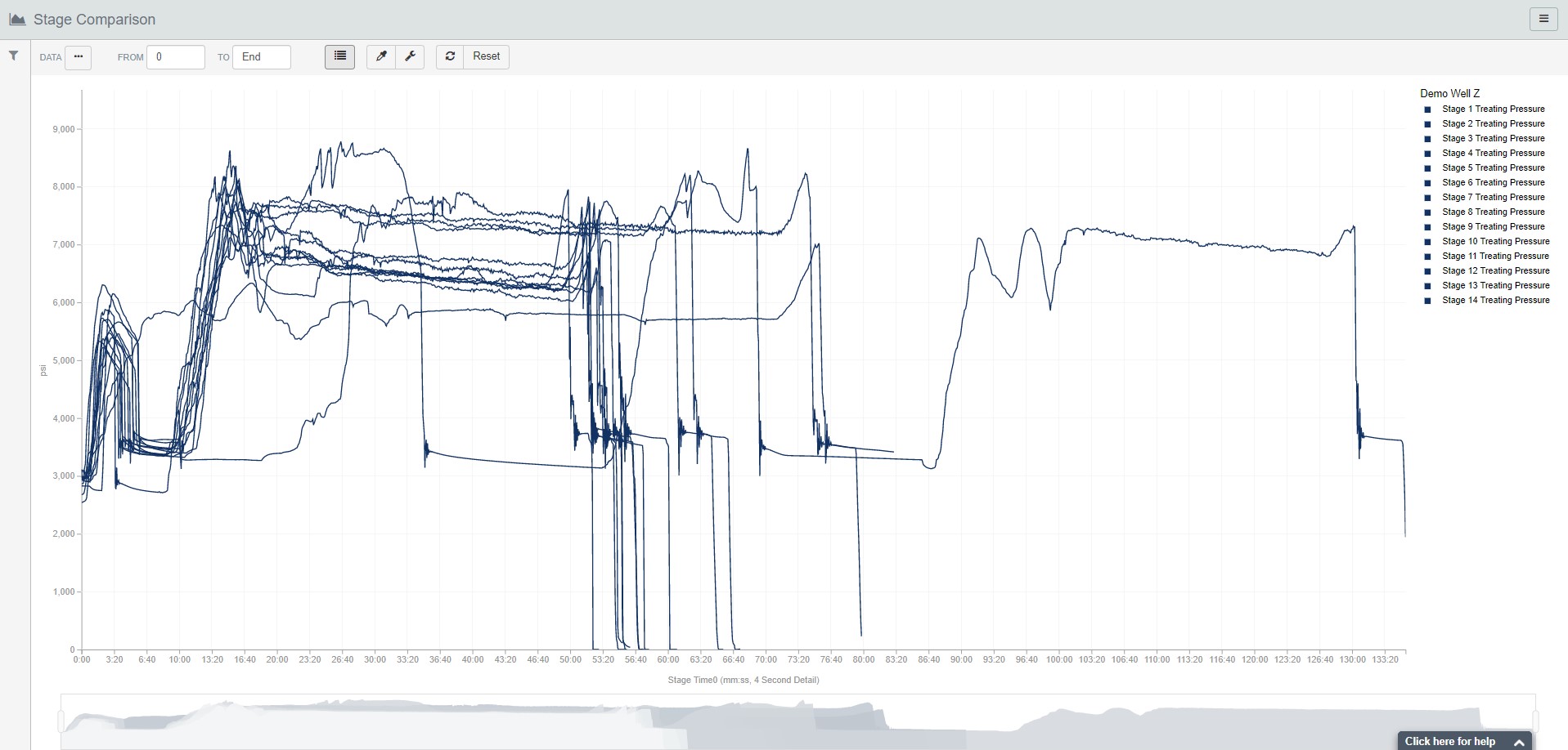
In the same way, you can select multiple options for each line, whether that line is a job or a data element on a job. "Flat" will give the same color for each stage in the line. "Gradient Min-Max" will produce a smooth change between each stage using the selected color as the starting point. "Gradient Color to Color" lets you define the two colors that the gradient will move between. And finally, "Cross Color" will hold the first color until the designated range crosses the set point, and then the color will change to the second.
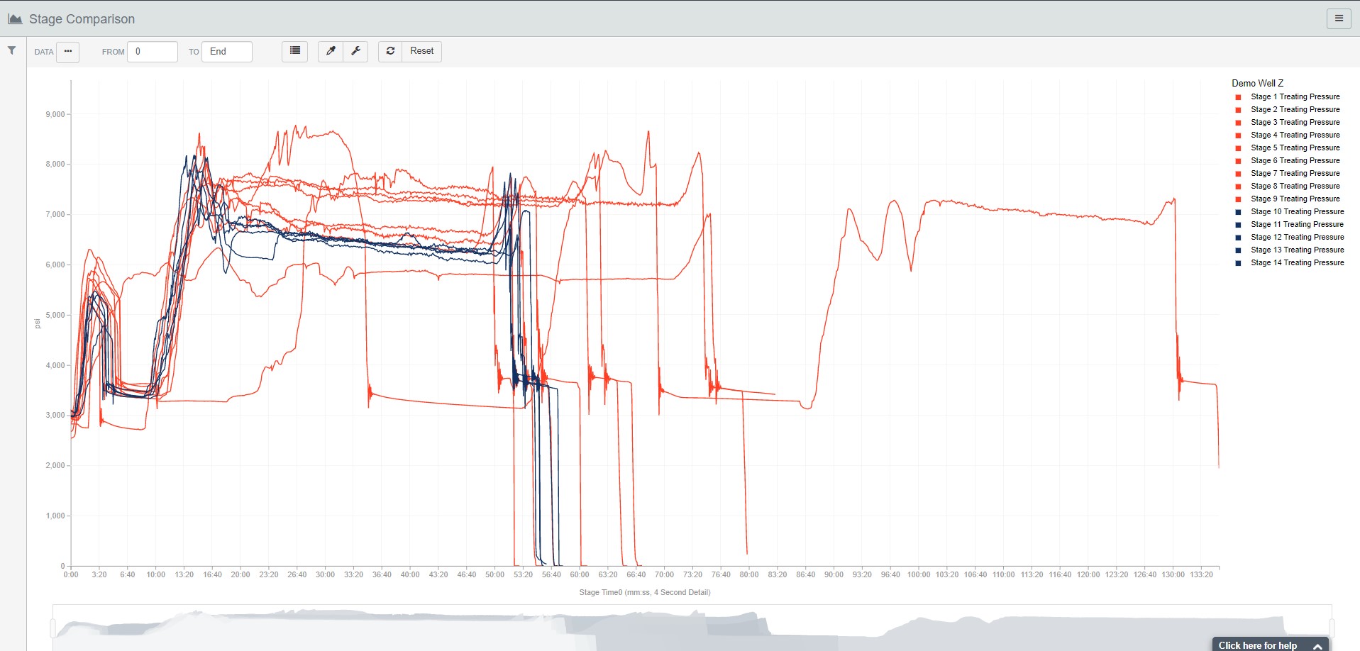
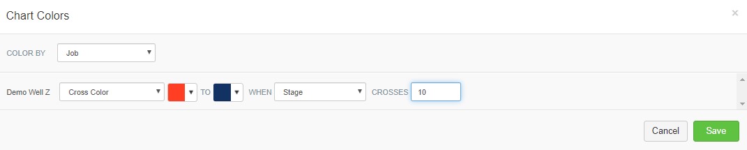
So when setting up a "Cross Color" line, you can choose the base color first and the switch color second. You can choose which element controls the cross color options, and finally, you define the value of the element to switch the color. For the example below, the chart will have a red line for stages 1-10, then all other stages will be displayed in blue.
With so much data flowing through the Stage Comparison page, we believe that these coloring options can help start revealing a more unique understanding about your completion. Now that you now how to set up gradients and complex coloring for your Stage Comparison plots, you might be interested to learn more about how to align your plots using Breakdown and ISIP flags.