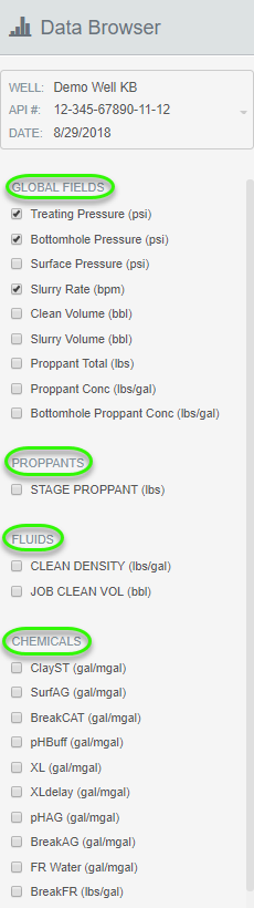
Ready to view your data? Data Browser is a great tool for examining how a particular job went. There are two sections you can select from. The first section is for any Global Fields you have mapped in Channel Mappings. The next section is for you to select any Other Data Channels (also mapped in Channel Mappings) that you would like to see, along with their current mapping assignment.
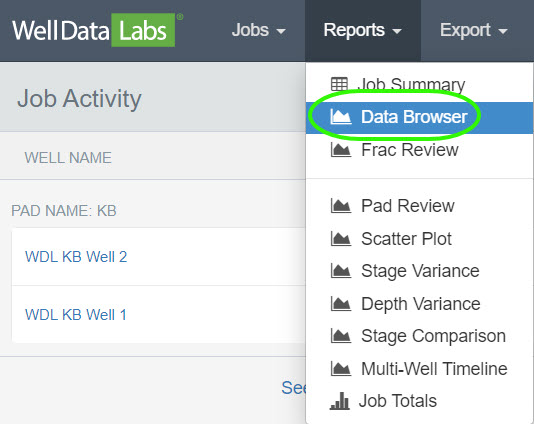
You will find the Data Browser Report in the Reports drop-down on the toolbar.
Using Data Browser:
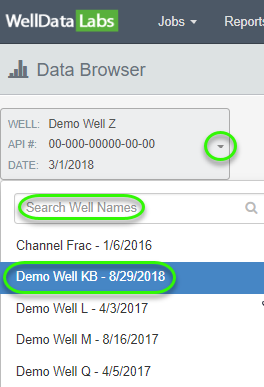
Find the well you would like to analyze by clicking on the down arrow next to the API # in the Job Selector on the upper left-hand side of the screen or by typing the Well Name in the Search Well Names field.
Next, choose which elements you would like to graph. You can select Global Fields and any Data Channels that were mapped in Channel Mappings, along with their current mapping assignment.
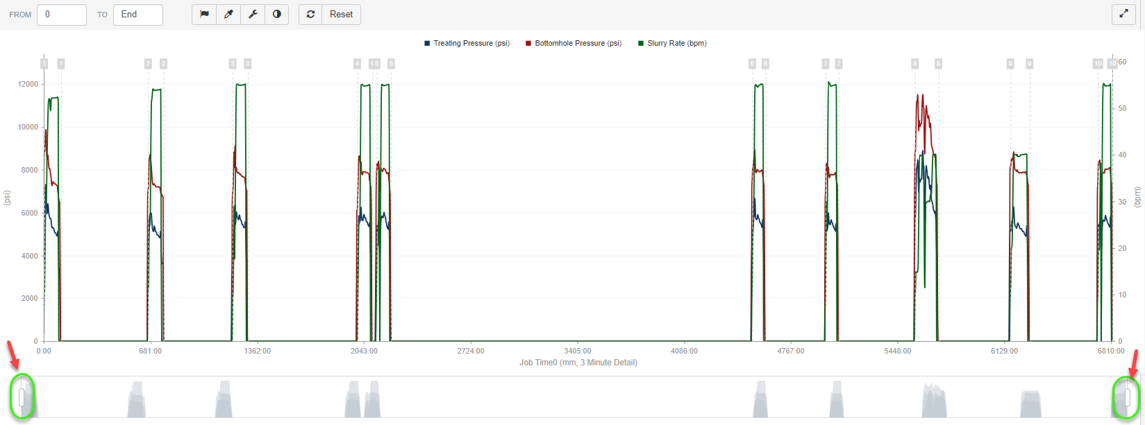
After selecting one or more elements, the data will be displayed in a graph. If you would like to take a closer look at a particular area on the graph, use the Zoom Slider which sits just below the graph and shows a shaded version of the entire job. Grab the white buttons on either side of the slider window to filter the selected data and zoom in. The Zoom Slider is just one of the many graph features in Well Data Labs. Learn more about our graph features along with customization options in our article about Graph Features.
After selecting one or more elements, the data will appear graphed in the center of the screen. There are a lot of graph features and customization options in Well Data Labs. Learn more about them with the article about Graph Features.
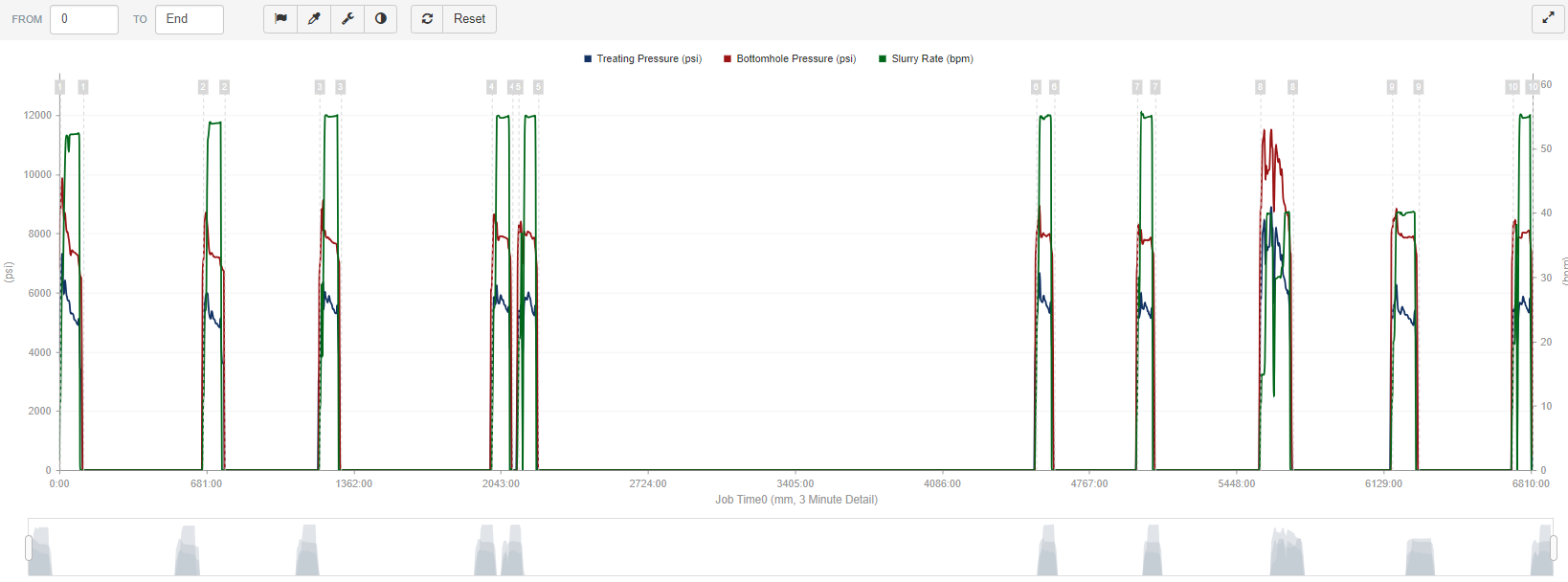
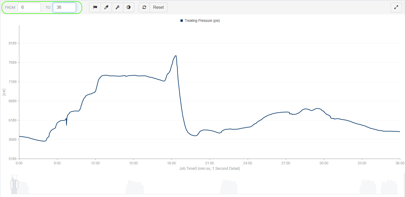
This is Stage 1 after zooming in a bit.
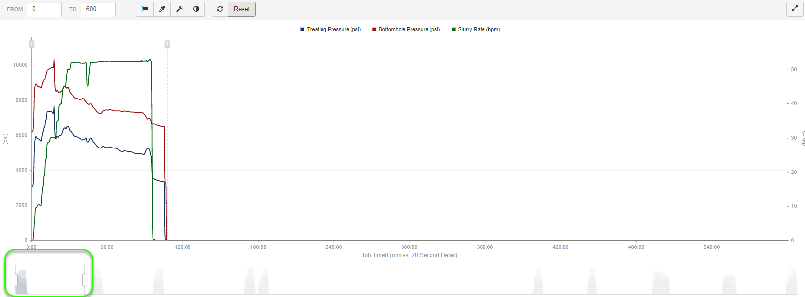
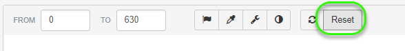
After zooming in or changing the detail of the graph, you can reset the entire time window and graph detail by selecting the Reset button found on the graph toolbar.
Per Second Data Drill Down:
Easily set drill down to per second data by setting the time period you want to drill down to and the Data Browser will automatically optimize the data display for performance and detail.
*Pro Tip: The browser will switch over to 1 second data when viewing less than 30 minute time increments.
Next, let's take a look at the tables below the graph.
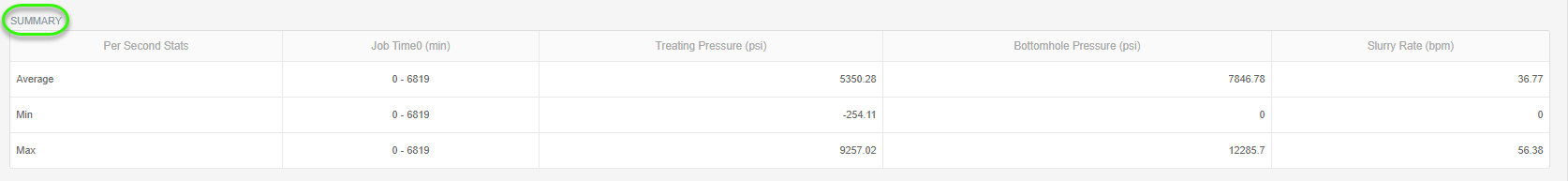
Summary Table:
The first table sitting directly below the graph is the Summary table. This table gives the Average, Min, and Max for the activated elements within the selected time window range.
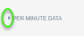
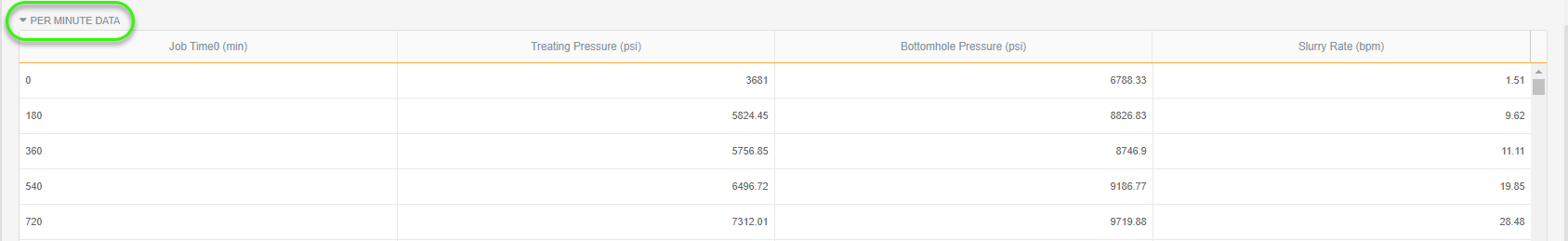
Per Minute Data:
The next table is the Per Minute Data table. Click on the arrow next to Per Minute Data to expand the table. This table averages the per second data to generate a point every minute for each activated data element within the selected time window.
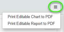
Printing to PDF:
The 3-bar button in the upper right-hand corner of the screen will give you options to Print an Editable Chart or a Report to a PDF file.
There are a lot of graph features and customization options in Well Data Labs. Learn more about them with the article about Graph Features.