What can we help you with today?
Get help straight from the team at Well Data Labs...
Multi-Well Timeline: Multi-Well Analysis - Report Overview
Reports/Data Analytical Tools
Multi-Well Timeline: Multi-Well Analysis - Report Overview
Updated 2 weeks ago
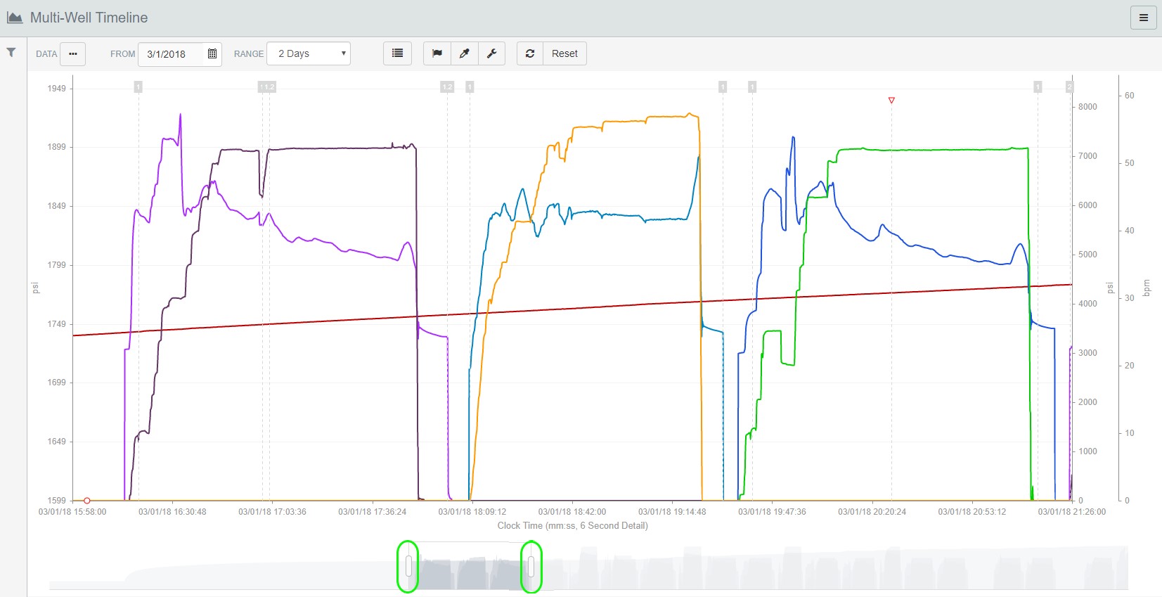
The Multi-Well Timeline Report lets you take a close look at several wells in the same time period. You’ll have the option of easily selecting the data you would like to see, using a date range from 1 day up to 21 days.
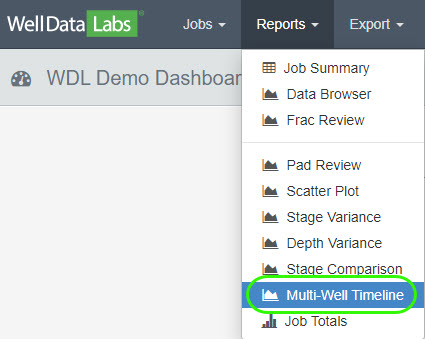
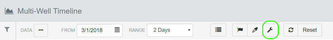
To get started, select Multi-Well Timeline from the Reports drop-down:
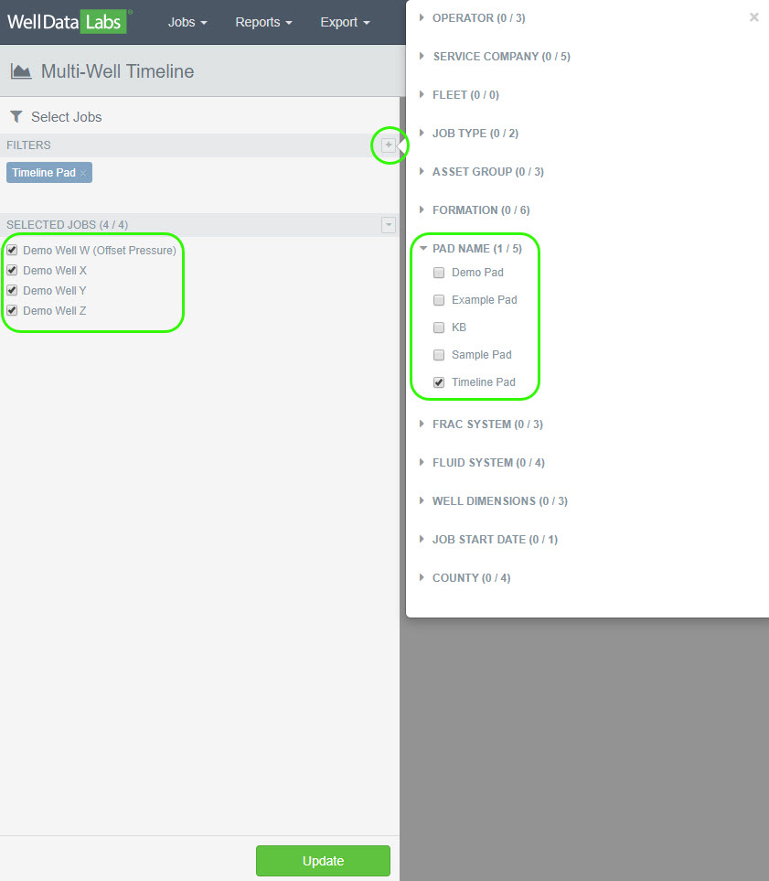
Using the filter, we are going to narrow down all of the jobs that are on the “Timeline Pad”. First, click on the plus sign next to filters to expand the selection. Next, click on the arrow next to “Pad Name” to see the available pads and select “Timeline Pad”. Notice, there are four jobs to select from, all with the Pad Name of “Timeline Pad”. Select "Demo Well W (Offset Pressure)", "Demo Well X", "Demo Well Y" and "Demo Well Z". Click "Update".
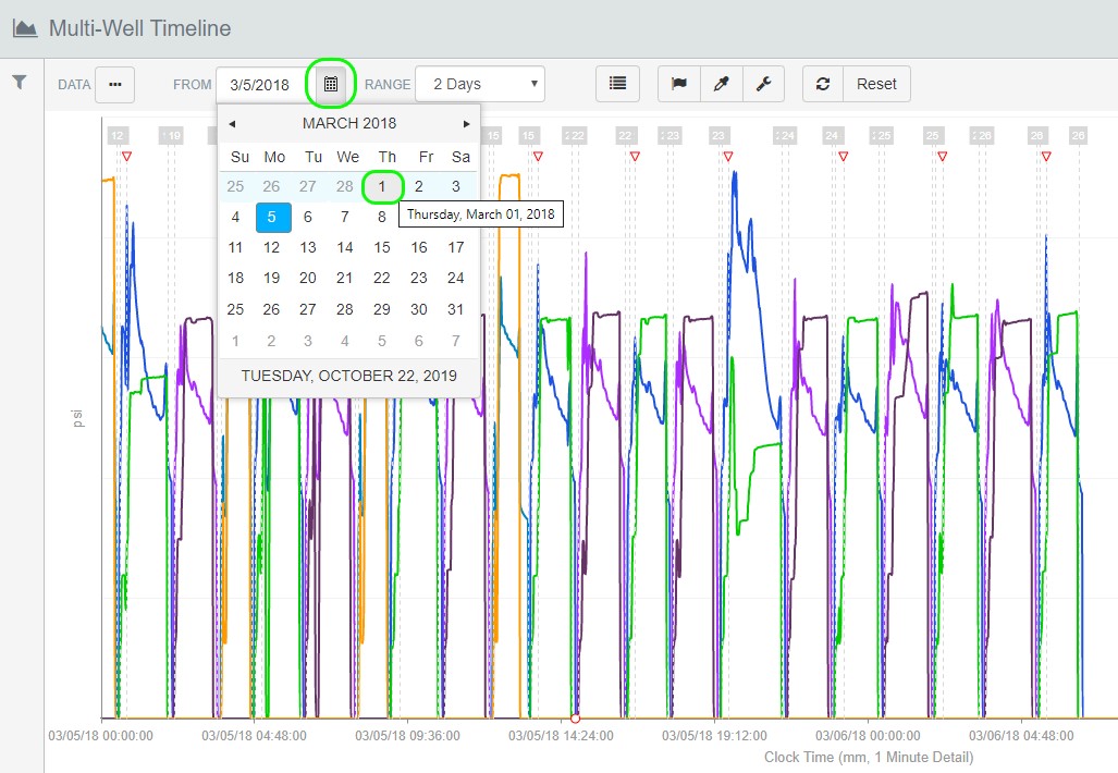
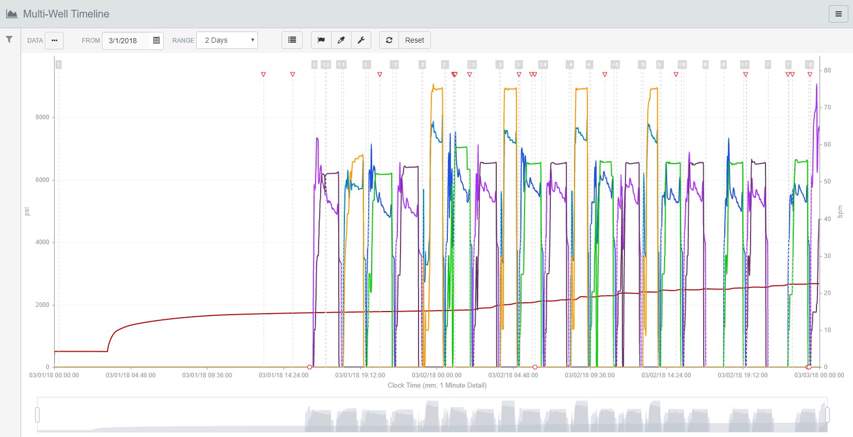
The graph defaults to displaying the Treating Pressure and Slurry Rate for Demo Wells W, X, Y and Z from March 5, 2018 with a Range of 2 days. You can change the date as well as the range.
You can also change the data you would like to see by clicking the 3-dot button next to “Data” and selecting the elements you would like. Add custom flags by clicking on the “flag” icon on the tool bar.
There are lots of options available in Well Data Labs graphs and you can learn more about our Graph Features in our “Close Look – Graph Features” article.
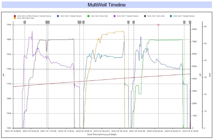
Y-Axis Splitting:
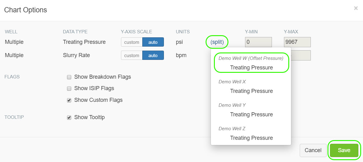
A separate Y-Axis can be created for individual data channels in Multi-Well Timeline. This is particularly helpful for offset pressure monitoring. Click the wrench icon on the toolbar to display chart options.
Click "split" to select which data channel you'd like to split off, in this example, "Demo Well W (Offset Pressure)". Click "Save" when you are finished.
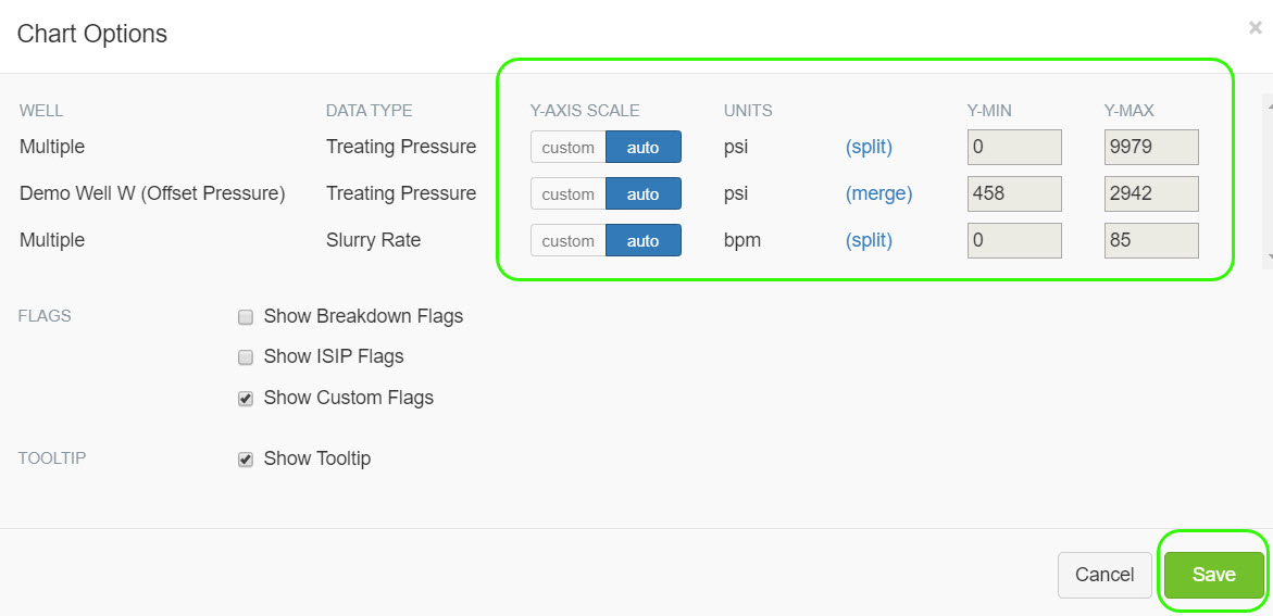
Once you click "Save", notice the selected data channel is split off and an auto Y-Axis scale has been applied to it. You can always apply a custom scale to any of the data channels. You can also merge the split off data channel back into the primary data channel if you'd like. Click "Save" again once you're satisfied with the chart options.
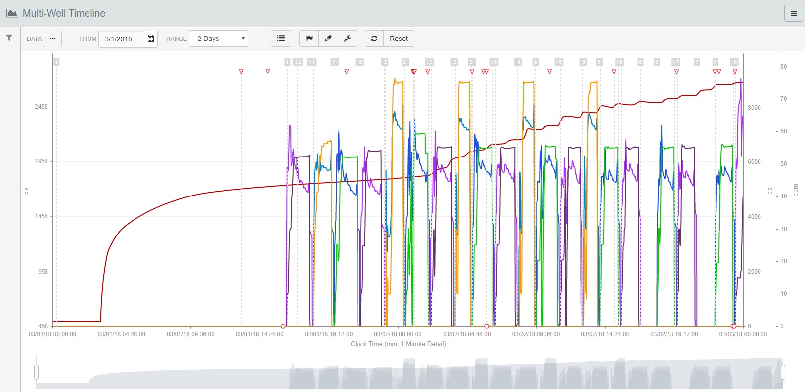
You'll now see Demo Well W (Offset Pressure) is on a separate Y-Axis scale and is easier to see.
Zoom Slider:
Use the zoom slider at the bottom of the graph to easily take a closer look at your data. Grab the white "handles" on either side of the zoom slider and drag them to where you would like the edge of the graph to be.
Print Editable Chart and/or Report to PDF:
You can easily print an editable Chart or Report to a PDF file by clicking on the 3-bar button in the upper right-hand corner of each page and making a selection.

If you have any questions or suggestions, we are always here to help and encourage you to e-mail us at support@welldatalabs.com!