Stage Comparison
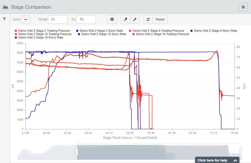
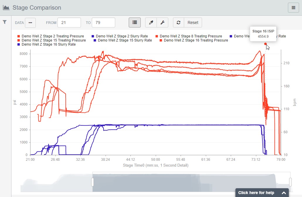
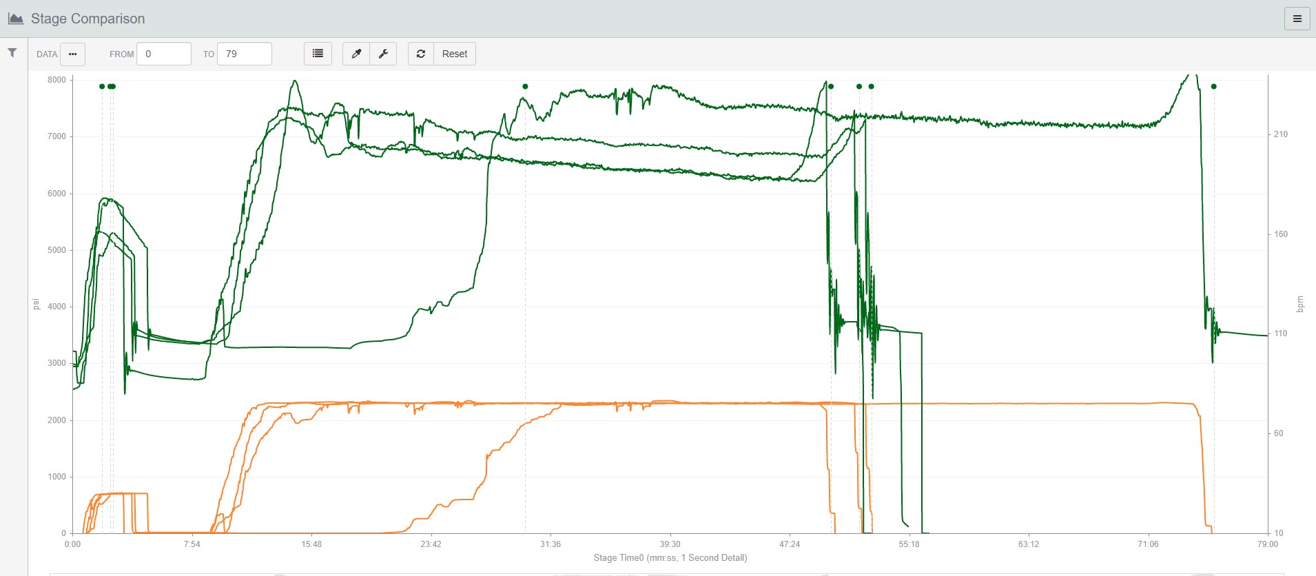
The Scatter Plot is great if you want to view a single datum for each stage of a collection of jobs, but what about all that 1 second data that we spent so much time mapping out earlier? Stage Comparison lets you quickly narrow in on a set of jobs, identify the stages you want to see, and lay data elements for those stages on top of each other.
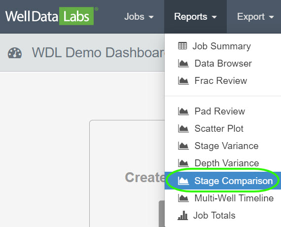
To access the Stage Comparison Report, click the Reports drop-down on the toolbar and select Stage Comparison.
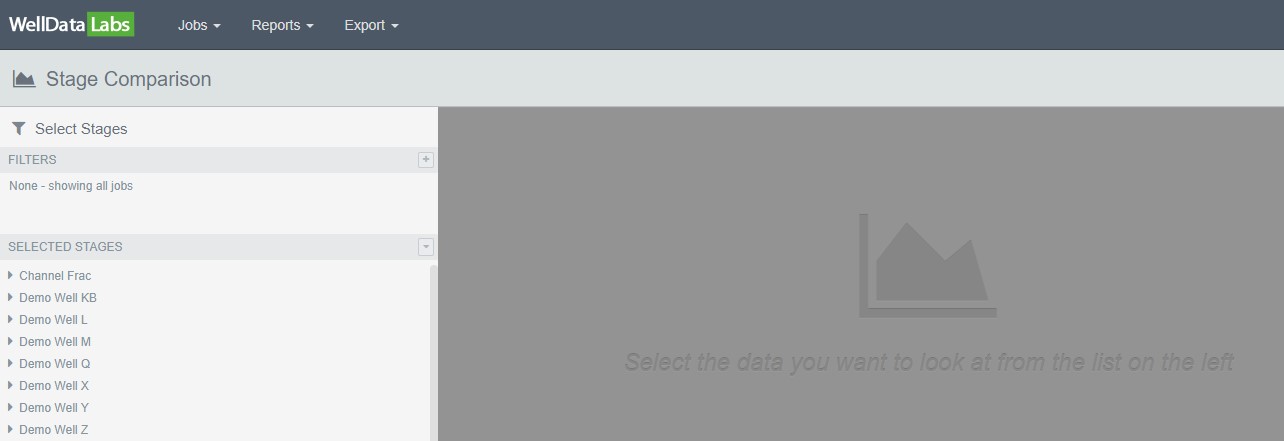
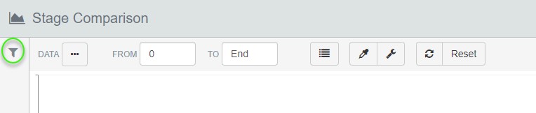
When the Stage Comparison window opens, you will be able to filter on the Jobs that you would like to take a look at.
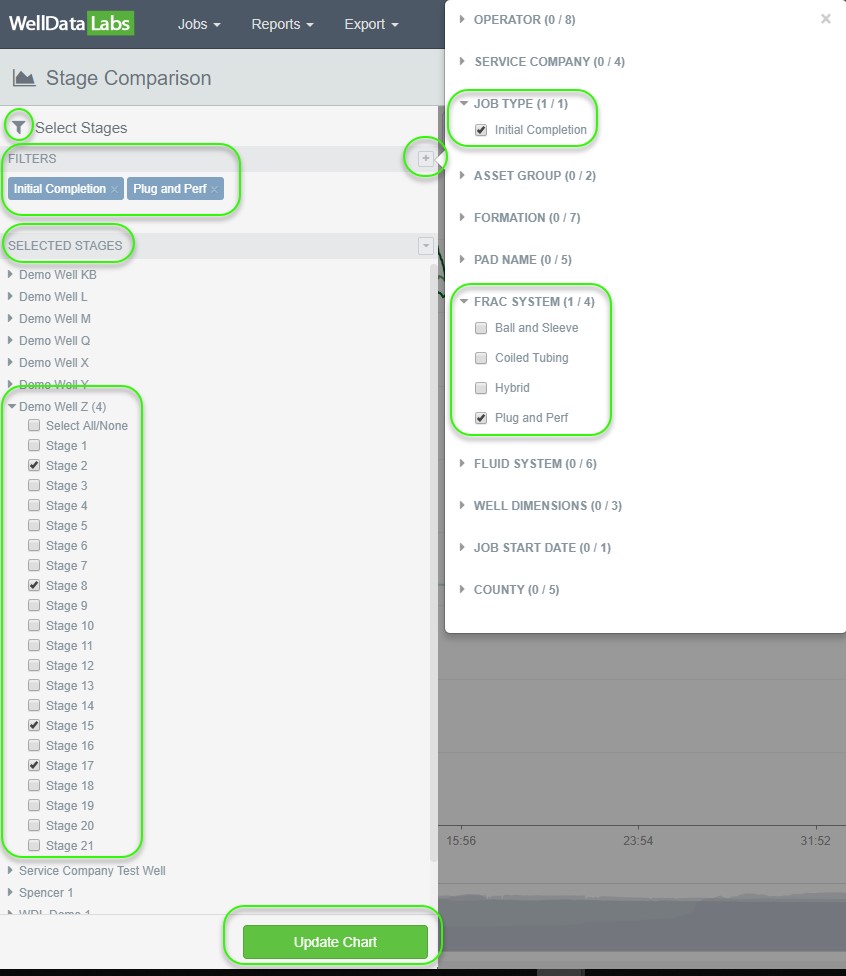
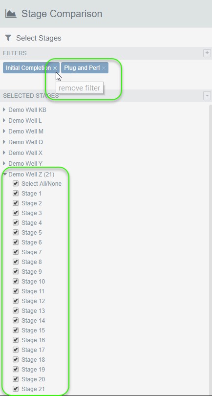
Begin by building out a Filter set to narrow down the list of Jobs and their Stages to select from. Click the plus sign next to Filters, then click the arrow to expand the available criteria for each element. Make your selections and click the "X" in the upper right-hand corner of the filter pop out. Notice your selections are now listed directly below the Filters section. Once you have selected your Filters, choose the Jobs and Stages that you would like to see and click Update Chart.
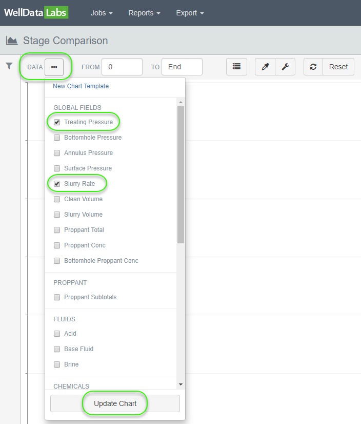
Once you have selected your Jobs and Stages the next step is to select the Data you would like to see on the chart. Click the 3-dot button located in the upper left-hand corner of the toolbar. Select the data elements that you would like and click Update Chart when you are finished.
To quickly make changes to the Jobs and Stages you are seeing on the chart, click on the Filter icon to return to the Selection page. Either add more filters by clicking the "+" (plus sign) or, remove them by clicking the "X" next to the Filters you previously selected. Add or remove Jobs and Stages by checking or deselecting any stage. As you toggle Jobs and Stages in the Selected Stages section, you'll see the chart update in real time.
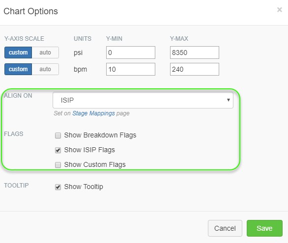
We've discovered that while charts of data are great, they're even better when you can adjust them to display what you need. Chart Options is where the Y- axis scale can be adjusted, you can choose to have flags displayed and toggle the tooltip on and off.
To open the Chart Options window, click the wrench icon.

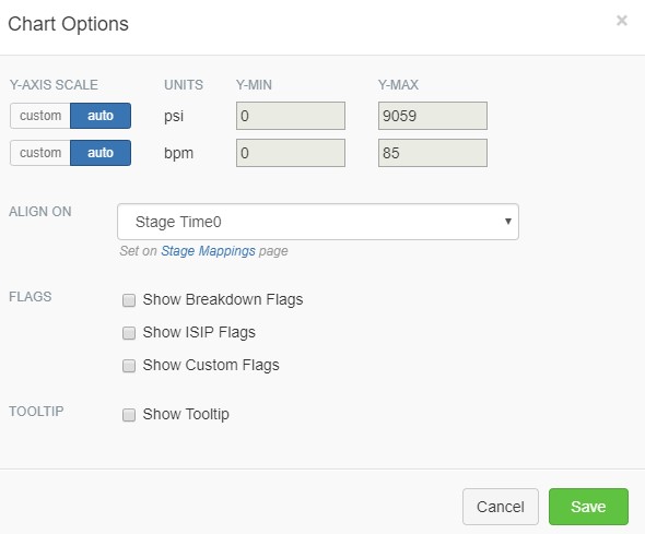
Using the Chart Options tool, you can also align your plots on the flags for Breakdown Pressure or ISIP, or using one of your "alignable" Custom Flags, instead of the stage initial time. This is a great way to examine the treatment plot behavior around these points of interest for each stage, especially when you use the zoom slider to quickly drill in on exactly what you want to see.
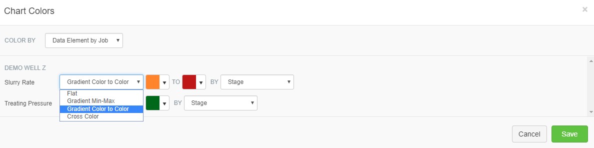
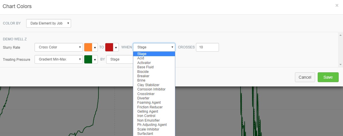
We provide powerful coloring options to try to help distinguish what is going on, so you can visually spot and dig into outliers and unexpected changes. You can customize the colors by job, data element or both simultaneously.
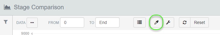
To open the Chart Colors window, click the dropper icon.
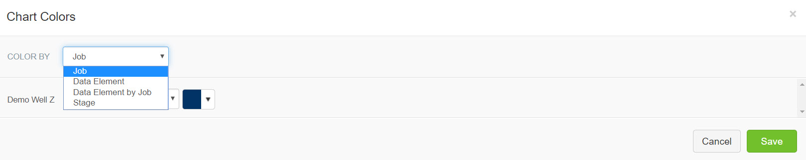
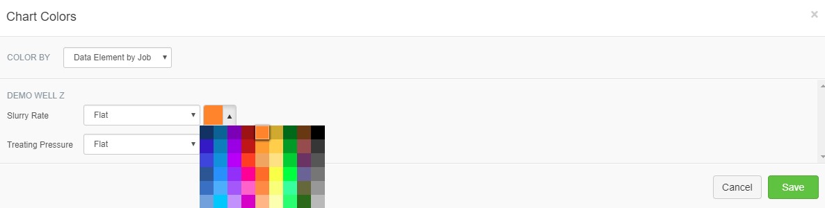
With so much data flowing through the Stage Comparison plots, it helps to visualize changes in a lot of different ways. Split your heel and toe stages into completely separate colors, or create a gradient that changes your pressure plot color based on FR concentration.
Stage Comparison provides a deep look at how the per second data from one stage or well compares to another. If you want to compare the calculated and aggregated values for your wells, you should take a look at Scatter Plot and Job Totals.